| Principles of Design | ||
| #1 | What principle of design is most obvious here? |
|
| #2 | When Tone/Value make the work 'Whole'.
|
What is 'Unity'? |
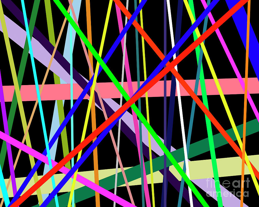
| #3 | Synonymous wth 'Rhythm.' |
What is 'Movement'? (The swirling lines show the principle of movement, and real texture in the thick, thick paint help create movement here!) |
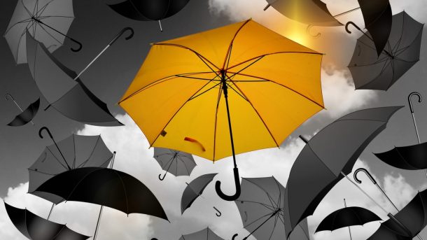
| #4 | Which Principle of Organization do you see?
|
What is 'Symmetrical Balance?'
|
| #5 |
Which Principle of Organization do you see here? |
What is 'Variety?' (of line thickness, direction, and color)
|
| Space and Balance | ||
| #1 |
A picture that is the same on both sides. |
What is 'Symnmetrical?' |
| #2 |
What type of balance is this? |
What is 'Asymmetical Balance?'
|
| #3 |
This type of perspective. |
What is 'Atmospheric or Aerial Perspective'? |
| #4 |
This type of perspecive. |
What is 'One Point Perspective'? |
| #5 |
Showing objects higher on the picture plane creates a sense of space and perspective. |
What is 'Positioning/Placement'? |
| Careers in Art | |||
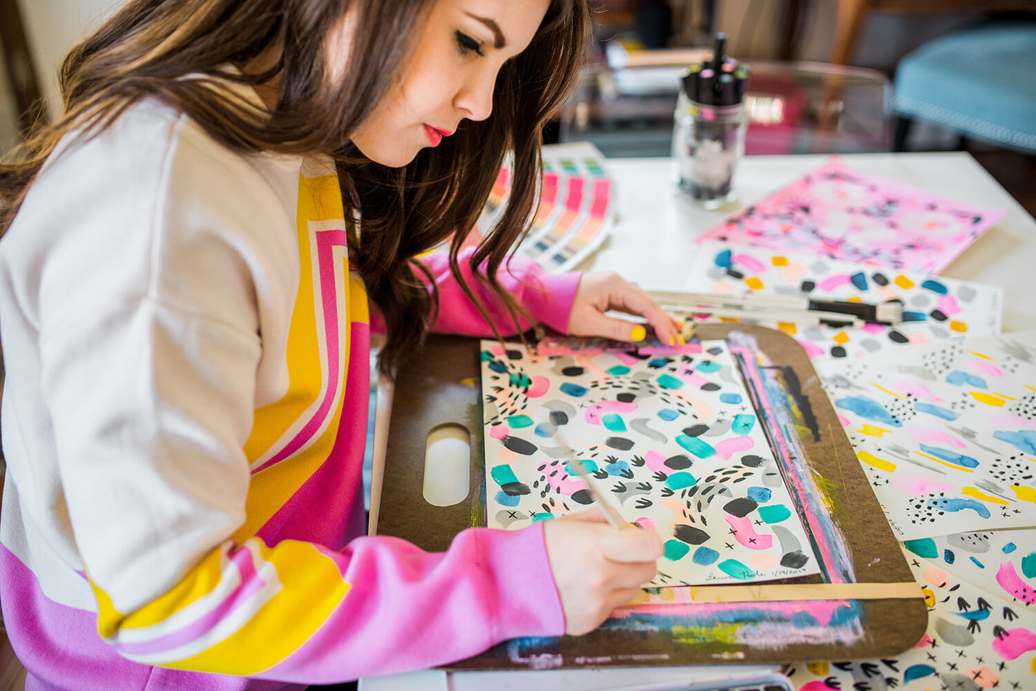
| #1 | An artist who creates ads or designs products. |
What is 'Graphic Designer'?
|
|
| #2 | An artist who weaves. |
What is a 'Fiber Artist/Textile Designer'?
|
|
| #3 | An artist who designs and transfers images to t-shirts. |
What is a 'Print Maker'?
|
|
| #5 | When you paraphrase someone's creative, original thoughts in your writing and pretend it's your own idea. |
||
| Color and Value | ||
| #1 | Next to one another on the color wheel. |
|
| #2 | Range of tones or value from light to dark can also be called this. |
|
| #3 | A primary plus a secondary. |
|
| #4 | Grey, black, white, tan. |
|
| #5 | This best creates the illusion of depth in a drawing. |
|
| Final Question | |